
PSA
A Family of Inclusive Skincare

Solutions
Brand Strategy
Image-Making
UI Design
Campaign Making
Overview
Skincare
Branding
A sister brand of Allies of Skin, PSA stands for Purposeful Skincare by Allies. A skincare brand driven by purpose, PSA believes skincare should be effective, enjoyable and made for every skin type, colour and condition. Their reason for being will always be to create products that deliver results you can see and feel.
We worked with PSA to create a cohesive brand language through image-making and marketing communications to establish an identity that could stand out in the very diluted market of inclusivity and greenwashing.


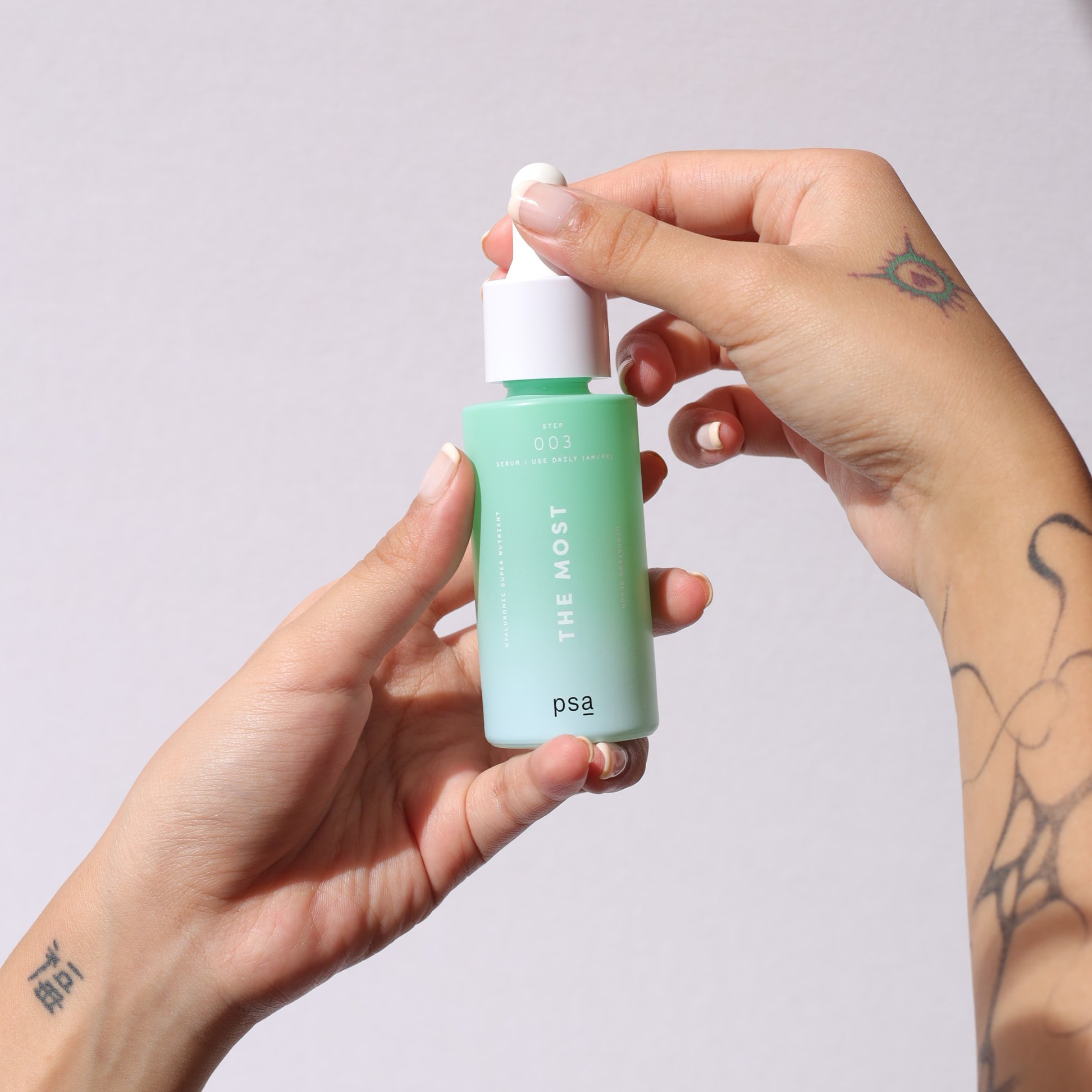
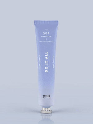
Kitsch and unexpected Packaging Design
We devised a vibrant colour formula that reflected the brand's DNA. Bottles, tubes and boxes came in full colour with a youthful gradient, which was quite different from competitor brands at the time, allowing the brand to stand out in retail. The packaging also drew much success online when we sent out press kits to KOLs together with stickers and other collaterals for a unique PSA experience.
An all-inclusive visual language for the odd, young and bold
Targeting Gen Zs, we wanted to celebrate the unique and expressive identities of our young audience, regardless of gender and sexual identity. The message? To feel comfortable in your own skin and celebrate you for you. PSA is a relatable voice in the skincare market delivering effective yet affordable products.
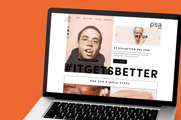
Going Guerilla
We created PSATELLITE.LIVE, a microsite for the pre-launch of PSA's official website. The microsite streamed a series of random, meme-ish videos and featured an 8-bit game that was coded into one of the channels. There was also a countdown ticker to the launch with a sign-up tab for customers to receive exclusive deals. This guerilla marketing approach garnered over 650 sign-ups before the brand even launched.